THE BEST/WORST ALBUM COVERS IN HEAVY METAL & HARD ROCK
HELLOWEEN – FUTURE WORLD
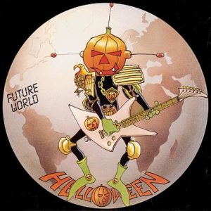
Based on Judge Dredd, to me, this was just a badass pumpkin with a Mohawk strumming an electric guitar. After all, it’s HELLOWEEN. Of course there’s gonna be some chill pumpkin dude killing it on guitar.
He’s kind of spacey and futuristic too. Well, that’s cause it’s the “Future World” single. The music is upbeat and happy. Seriously. It makes me want to dance a happy jig and hug people. OF COURSE the album cover is gonna have a lighthearted take on the band’s ongoing connection with Halloween and pumpkins.
I thought it was so awesome that I shared it Facebook. A “friend” commented to declare this the worst cover ever. I didn’t ask him to elaborate but I assume he perceived the artwork as over the top and consciously cheesy.
Gotta admit. He’s not wrong. Does that make it less awesome? Hell no! Just thinking about the space pumpkin makes me want to play “Future World” right now!
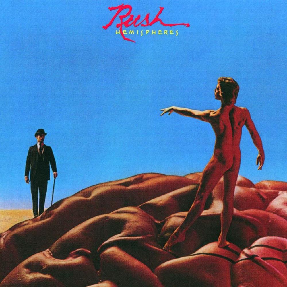
RUSH – HEMISPHERES
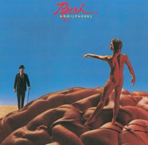
To many progressive rock fans, Hemispheres is one of the greatest albums on this Earth. When I bought this image on a t-shirt, I wore it with pride. That is, until I made the mistake of wearing it in front of my girlfriend.
She promptly asked why I had a naked man on my shirt. It was true. There WAS a naked man on my shirt. His bare-red alien ass was there for all to see.
What exactly IS the proper response when questioned about a naked man on your shirt? How does one explain the epicness that is Hemispheres to the uninitiated? I’m afraid my attempts to defend this iconic artwork were a complete failure.

Bending to the reality that most people will fixate upon a naked alien, the shirt was set-aside for special occasions. I once wore it to a Lou Reed concert and met a drunken Rush fan that joyfully shared adolescent memories of spinning Hemispheres on some long-forgotten turntable. This story was relayed with a smile as he shook my hand and walked away, absorbed in fuzzy memories of the days when vinyl was king. I’m afraid that only Rush fans will acknowledge the sheer awesomeness of the Hemispheres album cover.
MEGADETH – KILLING IS MY BUSINESS…AND BUSINESS IS GOOD
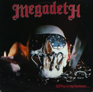
Looking back at Killing is my Business…and Business is Good, it’s clear that Megadeth was still in its infancy. For starters, the Megadeth logo was completely different than the famous logo that graced most of the band’s subsequent albums. Then there was Vic. He wasn’t quite the same Vic that we now know. He has been reduced to a cheesy plastic skull on par with a high school art project. Vic Rattlehead would be complete by the second album, but on their debut, we have an amazing concept that has been horribly executed.
Still, this early version of Vic is not without appeal. An underdeveloped mascot fits with the album’s rough production and unique, one-off logo. Besides, Vic was always in flux. While Peace Sells gave us the definitive representation of Vic Rattlehead, his appearance on So Far, So Good, So What was yet another permutation. The cover of Killing is my Business is merely an early incarnation of a beloved metal icon.
Fans may lovingly embrace this early version of Vic, but Dave Mustaine is less unforgiving. He was “mortified” when the finished product was unleashed, as the actual cover looked nothing like the sketches he handed to Combat Records.
Mustaine describes the cover as “a plastic Halloween skull and a variety of dime-store accouterments.” Ouch! Though the end result “smacked of amateurism,” this early Vic has an inherent awesomeness and is a beloved slice of Megadeth history.
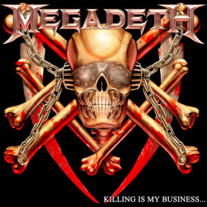
When the album was remixed and remastered in 2002, the cover was changed to bring the art more in line with Mustaine’s original vision. It wasn’t the same and the Combat artwork remains a favorite among fans.
LED ZEPPELIN – HOUSES OF THE HOLY
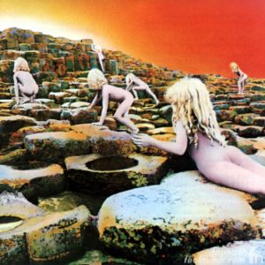
Naked girls climb over a rocky pyramid to answer a mysterious primordial call on this classic Led Zeppelin sleeve. Like the Rush example, my girlfriend made me realize that this iconic album cover is actually an awful aesthetic abomination.
While suffering a trip to the shopping mall, a little stand specializing in rock and roll stood like a beacon of hope against a backdrop of corporate blandness. My eye was drawn to the famous image of Houses of the Holy boldly emblazoned on a t-shirt. Boasted as an “all over t-shirt,” this was the essence of truth-in-advertising. No small graphic was affixed to the front of this shirt. Rather, the artwork was literally overblown on every available inch of fabric. This famous portrait of naked girls had never looked so bold.
My eyes only saw a rock masterpiece. Tracks like “The Song Remains The Same,” “The Rain Song,” and “No Quarter” were sprawling compositions that showed Zeppelin at their creative peak. Houses of the Holy may be the best of Led Zeppelin’s peerless albums and I was ready to purchase this t-shirt without hesitation.
But, alas, my girlfriend was quick to offer her input. A true representative of the general public, she sees what THEY see. A young girl’s bare ass on a t-shirt worn by a grown man is just a little weird. Okay, it’s REALLY weird.
After all, how could the average person know that the outer sleeve was part of a larger concept? Upon opening the gatefold, the fate of these poor deluded children is revealed. Each child will be a human sacrifice to an unknown entity. Fear compels men to offer innocence to appease a strange God. The scene is steeped in mystery with dark overtones. This is the best idea ever. It’s also one of the worst album covers.
JUDAS PRIEST – ROCKA ROLLA
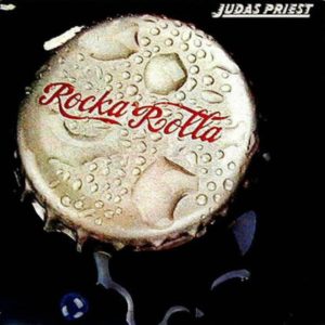
There was nothing “good” about the original cover for Judas Priest’s debut album Rocka Rolla. The visual depiction of a glistening bottle-cap is not memorable nor it clever. Yes, “Rocka Rolla” sounds similar to Coca-Cola. We get it. The artwork was simply a bad idea put into place without the band’s input or consent.
Later, after Priest became a successful international juggernaut, the cover was changed to an image befitting of the Metal Gods. What a gem. Look at this magnificent beast of metal.
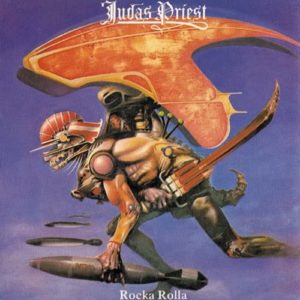
A mechanical dinosaur of muscle and steel, a series of levers allows for manual control. Capable of flight and armed with missiles and blades, this bringer of death can unleash destruction of unimaginable proportions. It’s simultaneously awful and awesome.
In short, the revised artwork creates a cover befitting of a band that embraced metal as no other group. This metallic beast easily fits besides iconic Judas Priest creatures such as The Hellion and Metallian.
BLACK SABBATH – BORN AGAIN
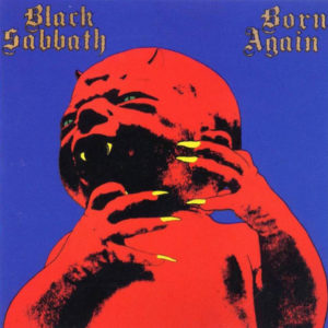
Ian Gillan famously puked upon seeing the cover of Born Again. A demon baby with glowing green eyes, this image was explicitly designed for rejection. Fearing that creating a Black Sabbath album sleeve would lose him a lucrative contract with Ozzy Osbourne, artist Steve “Krusher” Joule presented this demon-child to Sabbath management with the expectation that the band would pass on his submission.
The concept of a bastard devil baby was itself a hard sell. There was also the jarring color scheme. Red flesh clashed against a purple background. Flashes of yellow and green only served to underscore how ludicrously awful this Satan spawn was.
Turns out, Tony Iommi loved the intentionally bad piece of art. The guitarist reportedly thought it was hilarious and Geezer Butler expressed both disdain and love for the image, commenting, “It’s shit. But it’s fucking great.” Two heavy metal giants can’t be wrong.
A mocking caricature of metal’s affinity for horror imagery, Black Sabbath and a demon baby proved to be a perfect match. Ridiculously over-the-top, Tony and Geezer were right. The artwork for “Born Again” is both awful and amazing at the same time.
Works Cited
Joule, Steve “Krusher.” Liner notes to Born Again (Deluxe Edition): Black Sabbath. Sanctuary Records 2770406. CD. 2011.
Mustaine, Dave, and Joe Layden. Mustaine: A Heavy Metal Memoir. New York: It, 2010. Print.