
TASTING IN TOKYO: SUBLIMINAL HOMOEROTIC ALBUM ART OF THE SCORPIONS
Most of us are familiar with the eighties version of the Scorpions. In the decade before MTV and “Rock You Like a Hurricane,” the band steadily released well-received albums to an international fan base. Although these records arguably represent the band’s best work, the music is often overshadowed by their outrageous cover art. Some images were humorous while others were done in bad taste. They could also be strange. Very strange.
LONESOME CROW
It all started innocently. Lonesome Crow, their debut album, features a human hand towering over a scorpion. Seems logical. This diminutive, yet lethal creature is poised in attack mode. Two claws, reinforced by a stinging tail, have drawn blood.

Flipping over to the back cover, we see the full scale of its prey. A bearded young man lays dead. A mysterious crow sits on his bare arm, looking off to the distance. Perhaps this dark bird is in league with the scorpion. It’s equally likely that he works alone, and is indeed, a “lonesome crow.”

FLY TO THE RAINBOW
As an artist, how would you create a visual representation of an album titled Fly To The Rainbow? This is where things start to get weird.
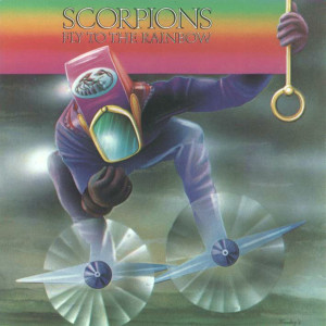
Where does one begin when examining the second Scorpions record? Let’s start with the title. The famous Scorpions logo has yet to be created. Instead, an instantly forgettable font is used to write the band’s name over a colorful background. To the right there is a handle gripped by a mysterious person. Metal blades attached to boots act as propellers. The rainbow-colored flag catches the breeze and this strange man is carried into the clouds.
It’s worth noting that gender is obscured. There is simply no way of determining whether a man or woman resides beneath this pink and purple space suit. Somehow, I envision the occupant of this bizarre outfit to be a man.
Naturally an image of a scorpion should be included, but is a pink helmet really the best way to display the mascot of an emerging hard rock act?
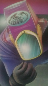
Then, there is the prominently displayed hand. What is he holding so delicately and gingerly? Actually, the embrace is rather sensual. This mystery object has completely absorbed the attention of our floating rainbow man.
Looking below, the cyclical blades of flight now take on a distinctly sexual nature. My instinct tells me they are breasts. This seems clear enough when one notes the round centerpieces that presumably attach the blade. But again, glancing back at the invisible object held so lovingly, I wonder if two round objects could possibly elicit other connotations.

It’s all very strange. Could the back cover be any worse? I can’t help but feel the universal reaction is, “MY GOD, WHAT IS HAPPENING HERE?”
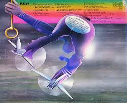
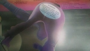
We now witness this strange scene from a rear view. Our pink clad hero still flies with his rainbow flag, which now displays song names and various credits. The eye is drawn to text that lists band members. Practical questions have arisen. The canvas above has reached capacity. Where could the artist possibly list the names of band members? Naturally they would be written on his ass. Yes, the names are literally displayed on the derrière of the rainbow man.
What a rear-end it is! Looking closely, the ass-crack is visible beneath the pink clothing. It’s impossible to ignore the head. Viewed from this angle, this “head” is merely a pink protrusion that dangles between the legs, hanging below the buttocks. Bending over, he is still holding an unknown object uncomfortably close to his face.
Yes, let’s reprise that universal reaction. “What is happening here?” Not even band members can explain. When asked to discuss the cover, guitarist Uli Jon Roth distances himself and tells us, “As for the meaning, I can only guess, but I’d rather not.” We are forced to draw our own conclusions.
IN TRANCE
The cover of In Trance, the follow-up to Fly To The Rainbow, seems desperate to assert the band’s heterosexuality. A beautiful blonde suggestively straddles an electric guitar. Controversy erupted, not for the objectification of women, but because one of the model’s breasts was exposed. Blacking out any trace of a bare breast rectified this perceived breach of decency. This would be the first of many Scorpions albums that were modified for the marketplace.

VIRGIN KILLER
Virgin Killer features what may be the most notorious banned album cover of all time. A prepubescent girl is displayed nude. While her genitalia is covered by broken glass, a photograph of a naked child was used to promote an album bearing a sexually suggestive title. Naturally, the art was swiftly abandoned. Original pressings can be found on Ebay but all subsequent copies feature a simple photograph of the band. Curious parties may find the original image through a quick Google search.

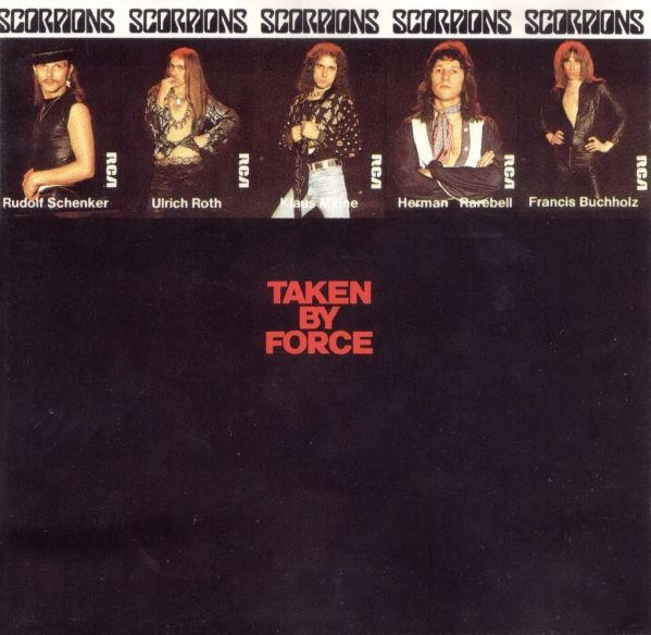
TAKEN BY FORCE

Wisely abandoning sexual imagery for Taken By Force, the Scorpions still managed to run afoul of the censors. A military cemetery provides the setting. Two children, brandishing toy guns, engage in mock battle amongst the headstones of fallen soldiers. It’s a sobering concept. The image forces us to ponder the ingrained violent tendencies that taint human nature. Deemed offensive, the image was replaced with photographs of band members pushed to the upper margin. Most of the actual space was simple black with the album title in red. Much like the previous record, the new album cover used for Taken By Force is surprisingly tame. Even boring.
TOKYO TAPES
After all the controversies surrounding previous records, the release of a double live album must have been a relief. Simply hire a photographer to take live photos on stage and choose the best for the cover. At first glace, it appears that this is precisely what happened. But, alas, in the Scorpions universe, album art is no simple undertaking.
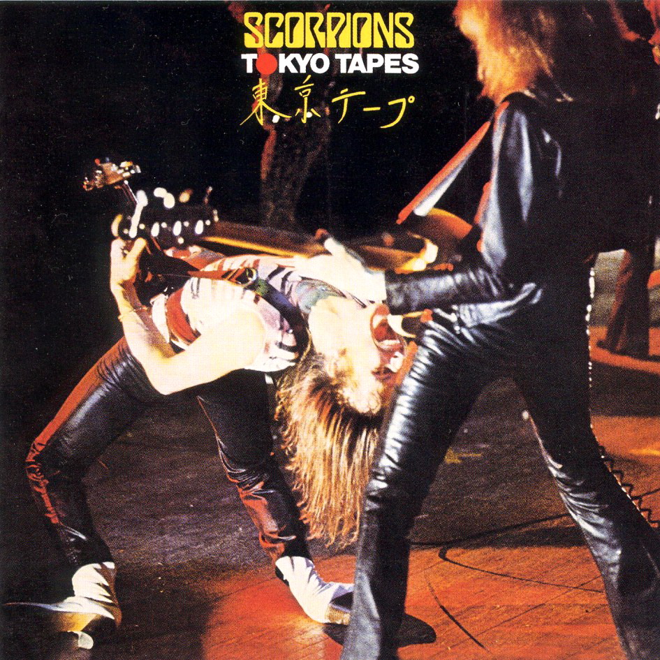
Although only two musicians are shown on the cover of The Tokyo Tapes, it’s quite an impressive live shot. Black leather dominates the photograph. Rudolph Schenker’s white shirt and pale flesh adds a splash of color against a very dark background. In a fit of fury, he bends over backwards. His head is literally upside-down! A long mane of hair hangs toward the floor. Enraptured with the ecstasy of live performance, he is shown expelling this intensity through a visceral scream. It’s a violent, intense reaction. His mouth is forced wide-open, white teeth on display. The guitarist is locked in an unnatural posture that requires inhuman flexibility. The photo is obviously manipulated. After all, not just any image is worthy of a Scorpions album. The band has a tradition of shock value to uphold.
Close examination reveals Schenker’s head coming uncomfortable close to the groin of his bassist. Clad in black leather, Francis Bucholz, looks straight ahead and tightly grips the long, black neck of his bass. His arm, also covered in leather, extends squarely in the direction of Schenker’s open mouth. Any closer it would look as if he would be taking a bite out of a mystery object protruding from black leather pants. It’s rather strange that a photo would be doctored in such an odd-pose. Perhaps one thinks too much.
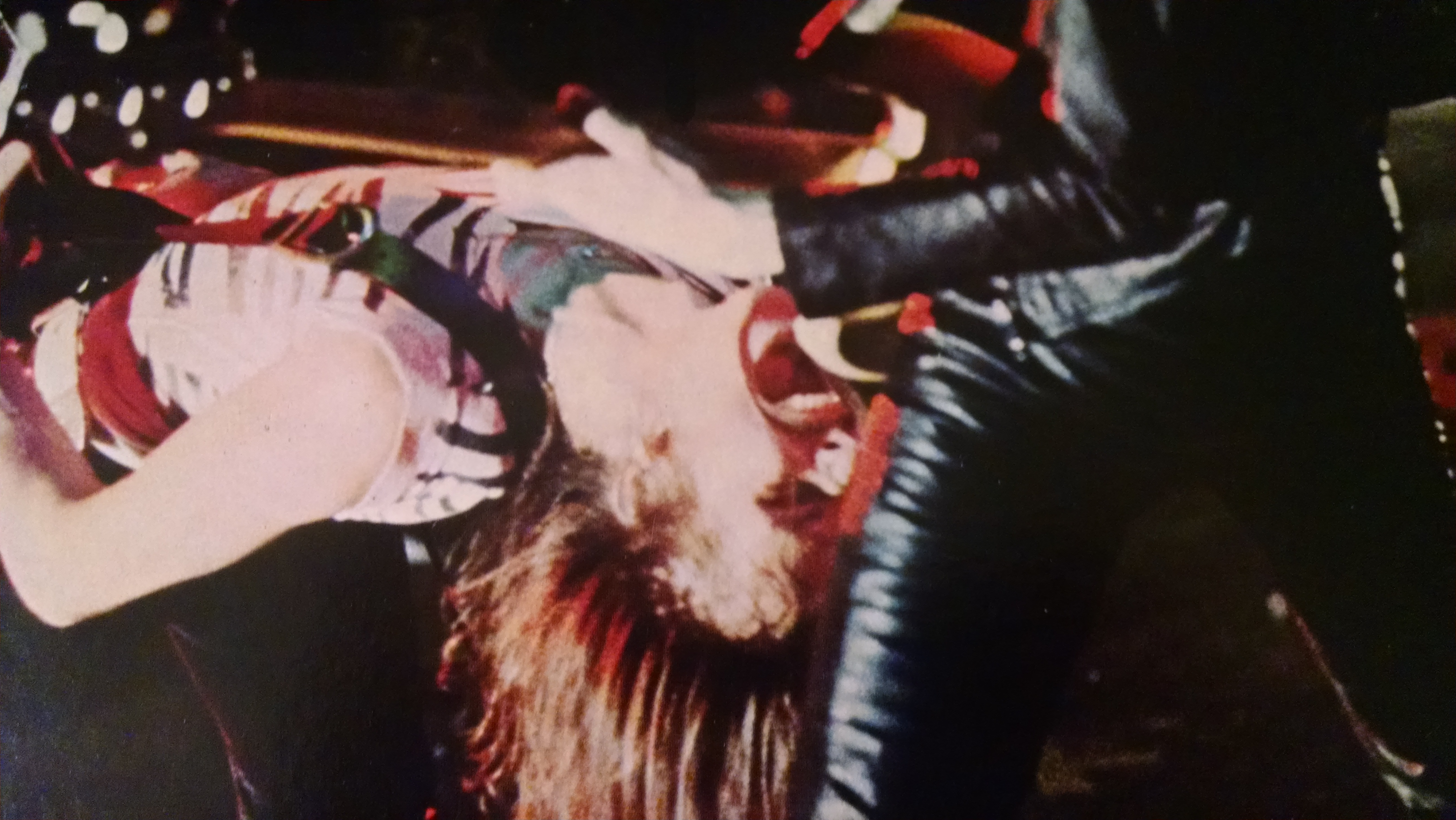
Turning to the inner gatefold, there are the typical live photos one would expect among the liner notes. Then, there is the main photograph. What is he holding? My God! Haven’t we been here before?
Looking up, the victim of this intrusion points at us and smiles. “Gotcha,” he says, having a laugh at our expense.

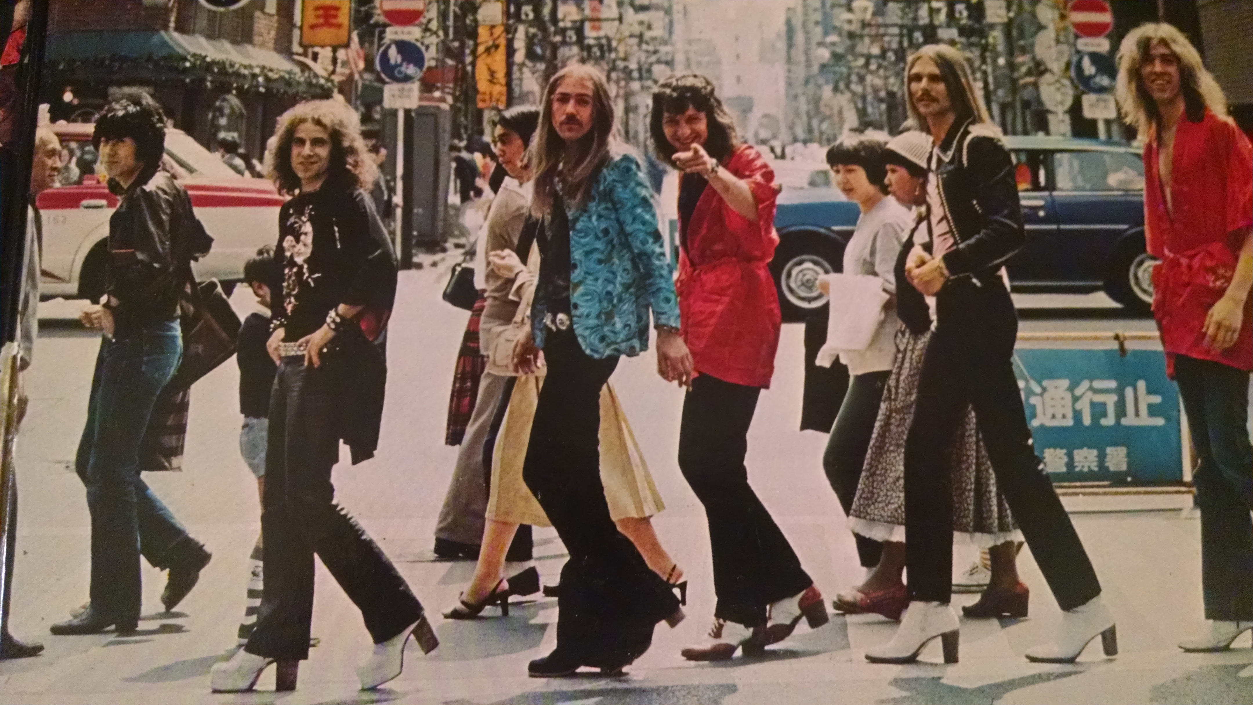
The photo is clearly staged. The band members that flank the ends of the group both smile with laughter in their eyes. Uli Jon Roth looks annoyed that he was forced to be involved. Next to him a Japanese woman passes by. She sees what’s happening. The look on her face is one of shock. Possibly disgust. It’s likely a look of surprise that will fade to amusement.
Of course we know everyone is in on the joke. Most of the natives feign ignorance, not even turning to stare at the crazy longhaired Germans brightly dressed in ridiculous fashion disasters. The Japanese man in the front stares directly at the camera and laughs at us too. The one doing all the grabbing looks cool, composed, still trying to play that nothing is going on, but knows the jig is up. Yes, there is no mistake about what is happening here.
LOVEDRIVE
One again, homoerotic images have been subliminally inserted into a Scorpions album cover. Will the band repeat the past when choosing art for their follow-up? Ladies and gentlemen, I give you the cover of Lovedrive.

Let’s start with the obvious. There is chewing gum on that woman’s breast! At least, I THINK that’s gum. It’s pink. Structurally sound and strong, this substance is an elastic marvel.
The woman looks distinctly uncomfortable. Are we witnessing an assault? She looks straight ahead. Her gaze is fixed upon some distraction beyond the immediate situation. It’s as if she is solemnly waiting for the moment to pass. I want to find evidence that this is a playful interaction but only see fear in her eyes.
What of her counterpart? Well, he just oozes sleaze. His gaze is the opposite of hers. Downward cast and eyes closed, he is intently focused on forbidden urges fulfilled. It’s the embodiment of alpha male arrogance. This man is boldly heterosexual. And so are the Scorpions.

The flip side reveals that it really was just a simple laugh. Big cheeky smiles assure us that all is well. The couple holds a picture of the band but the focal point is to the right of the portrait.
A bare breast! How scandalous! It’s as if they learned nothing from the In Trance experience. Perhaps they thought that relegating nudity to the BACK COVER would elude the censors.
Again, you guessed it. Banned! We’re spared another photo of their ugly mugs in favor of a blue Scorpion. It’s not exciting but it’s sufficient. It fits.
The edgy artwork of Lovedrive allowed the band to conclude the seventies in true Scorpions style. One last banned record to bolster their reputation as a rebellious hard rock band unwilling to play it safe. The Scorpions would find their greatest commercial success in the eighties, and though their album covers remained provocative, the art remained comparatively tame.


Bravo! Great writing + this article had me cracking the hell up lol You’re Twisted & Talented, I love it 👍
Don’t stop without deconstructing the various Animal Magnetism covers! Love Drive was hardly the end….
I was very tempted to keep going. My biggest concern was dragging the article out and making it too long. With Lovedrive being the last album released in the seventies, it struck me as a logical stopping point. Perhaps this article needs a sequel to explore the 80’s discography.
I think this is one of the most important info for me. And i’m glad reading your article. But wanna remark on some general things, The web site style is great, the articles is really excellent : D. Good job, cheers
you missed Animal Magnetism ¡ that cover is part of their weird covers